
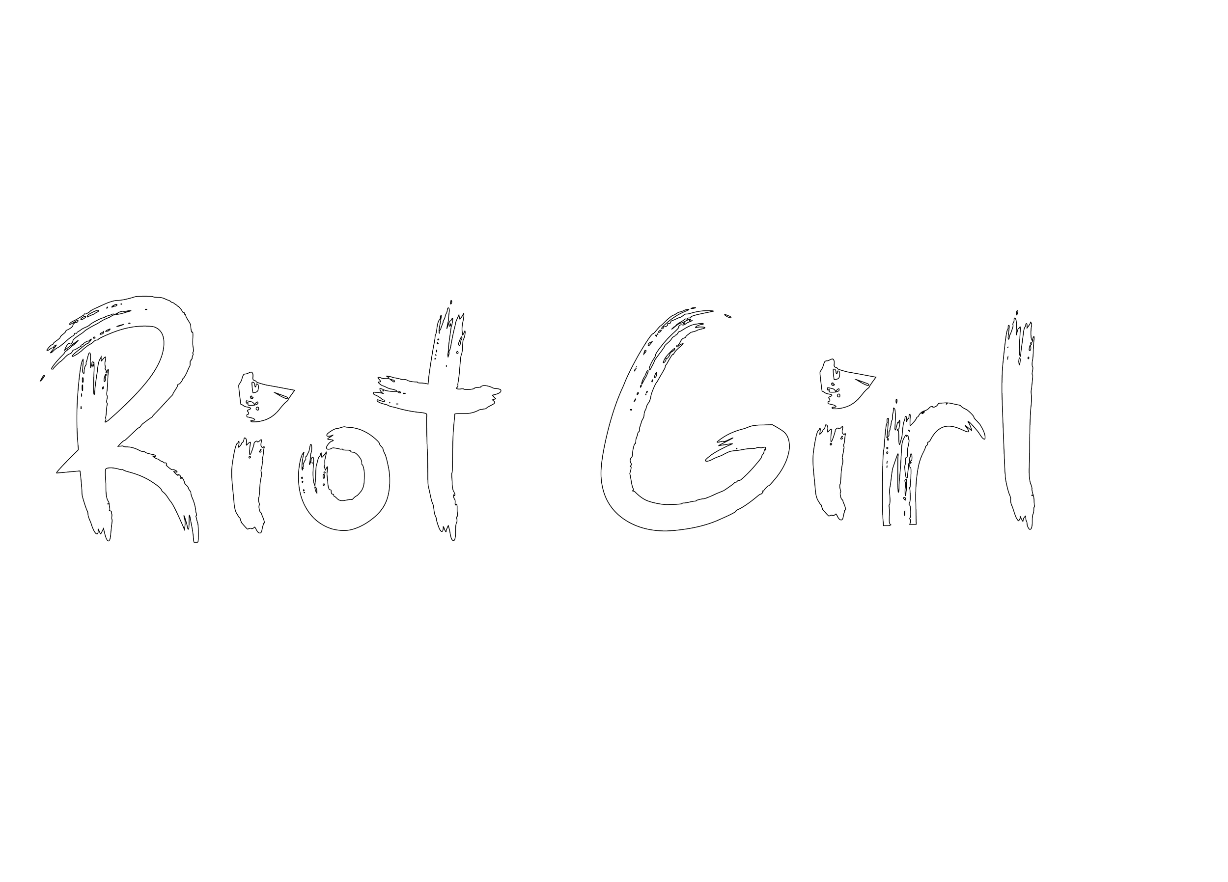
Riot Girl
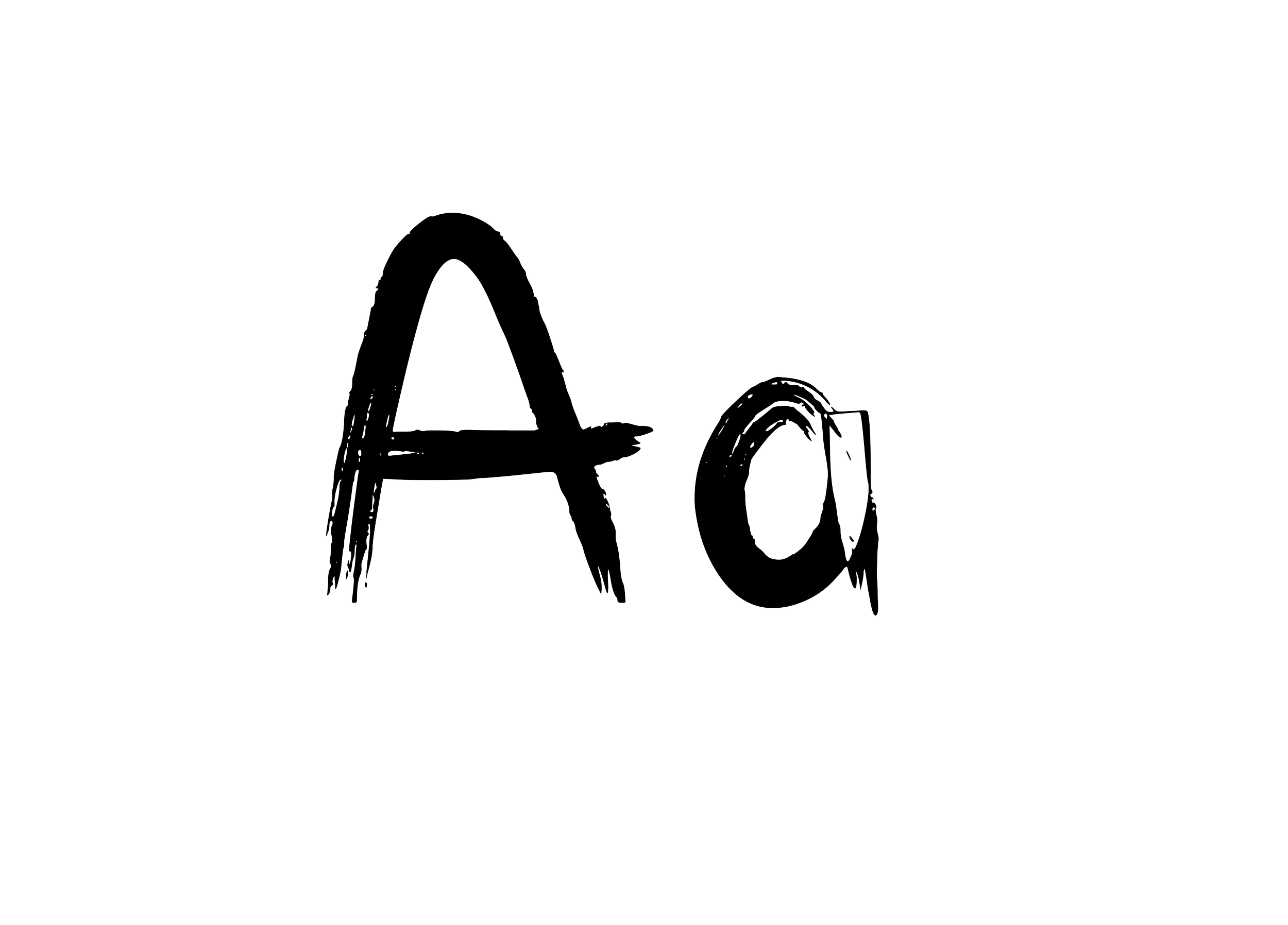
Typeface
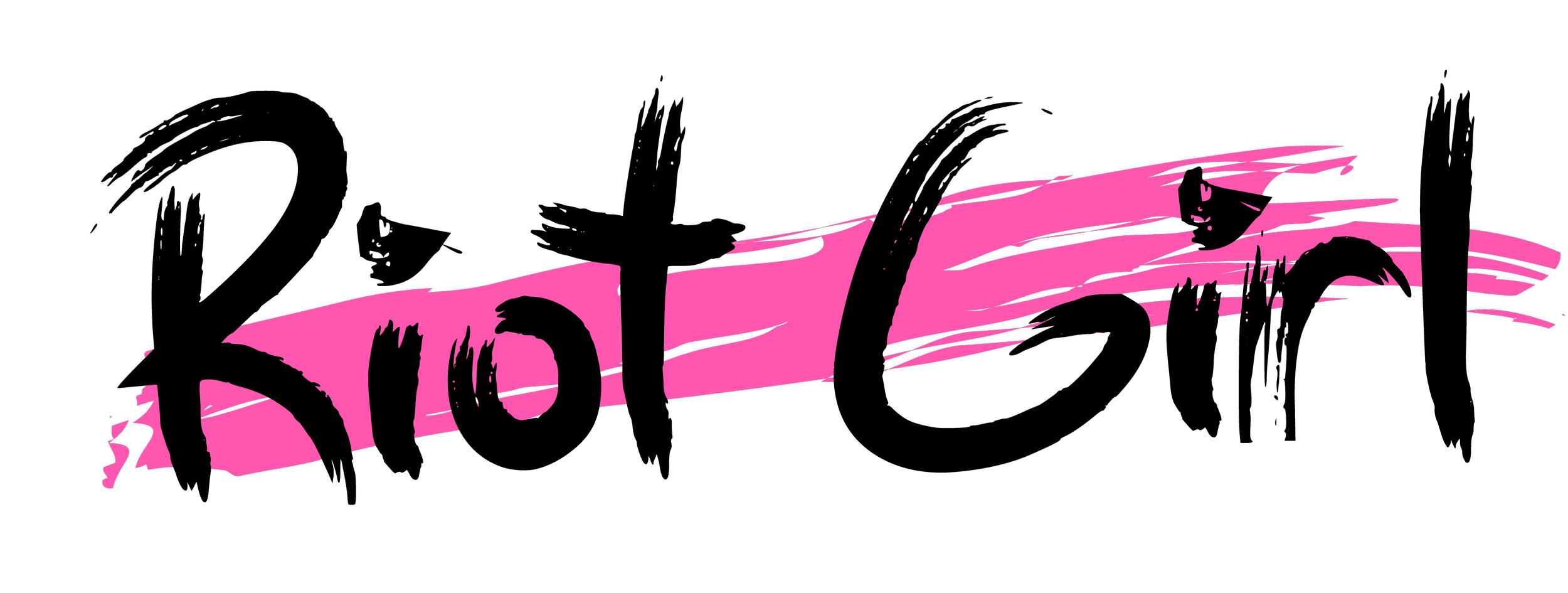
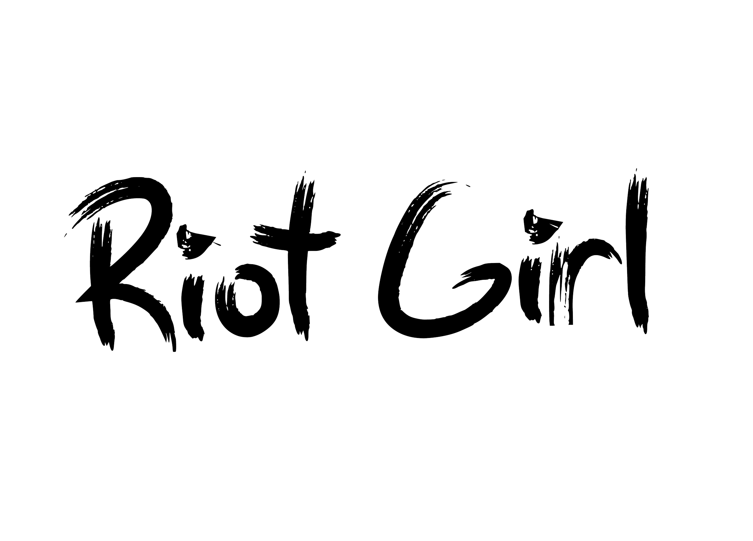
Riot Girl
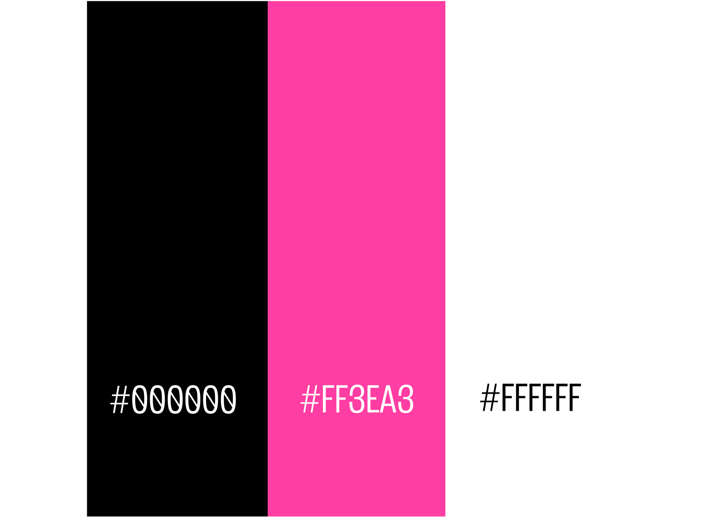
Color Palette
Typography
Riot Girl is a custom display typeface developed from my own handwriting. Inspired by expressive lettering and personal mark-making, the project explores how handwritten forms can be transformed into a cohesive typographic system while retaining their original energy, personality, and character.
Role
Graphic Designer
Timeline
4 days
Tools
Illustrator
Deliverables
Custom Typeface
The Brief
The goal of this project was to create a fully realized typeface from hand-drawn letterforms. Through digitization, refinement, and character development, the final typeface balances legibility with expressive visual qualities, resulting in a distinctive display font that reflects the spontaneity and individuality of its handwritten origins.
Logo Development
Brand Identity
Logo